As you may remember from the first post in our color series, we will be sharing the hottest colors of the season with you, what they mean, how they can be used in interior and exterior design, and, simply put, why they are great colors.
October is the epitome of autumn, the changing of leaves and the first touch of frost in the air in many places. Because of this, we tend to steer away from bright colors in all things design – from our own wardrobes to the colors of our place settings – to initiate the tranquil months of the season. Not to mention one of the largest associations people make with the month of October, Halloween.
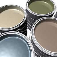
 So, based on trend research and our own experiences in design and related publicity work, we have narrowed down our October color to a soothing, khaki green. A similar color was selected as one of the top ten new colors for spring 2010 by Pantone, but we thought we would write about it now because it is greatly relevant.
We continually see new home and garden products every year in the marketplace adopt this color, as it is a classic neutral for design. It matches everything, blends well into the background, or can be combined with other colors to create striking focal points. It is also the perfect complementary color for common rustic fall décor items in orange, burnt-reds, browns, and other color hues.
What does green denote?
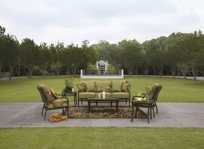
Green, especially the soft, soothing olive or flax color, is often associated with nature, nourishment, balance and stability. You’ll often see this color in commercial buildings, offices, spas, and hotels, as it is frequently used to promote physical and emotional well-being. Designers also enjoy using the color when re-designing an outdoor living area for a rejuvenated and natural look. An example: Summer Classics, a manufacturer of high-end casual / outdoor furniture, uses this color in one of its premier garden collections, part of the Skye line:
In the Home: Green remains one of the most commonly used colors in design. This neutral khaki green is incredibly flexible within a space and can easily find a well-suited fit in a large  room or small nook. Many designers suggest using this color en masse because it so easily adapts to new accessories and furniture. Furniture fabrics and draperies are an excellent choice, as the color is not too dark to overwhelm the space. However, accent pieces should not be overlooked. Lamp shades, mirror frames, art, throw pillows, linens, and accent chairs are easy ways to supplement and harmonize this shade of green.
In the Landscape: As fall brings in the cooler weather, foliage becomes a focal point more so than blooms.  The color of dried herb can be found in dozens of groundcover and perennial varieties for beds and border. However, while plant options are in abundance, we highly suggest accessorizing with this color in the landscape, much like one would with interior design. This color can often have a provincial or sylvan feel, yet add gorgeous ambiance to spaces in the forms of potted containers, accent or vertical garden walls, outdoor furniture, and even painted shutters or doors.
Our favorite shade:
Terrapin Green by Benjamin Moore is a perfect shade of green for flexible, calming design. With just a touch of gray to add neutrality but with enough green to make it pop, this color can be used in hundreds of different ways in interior or exterior design.
We also recommend the color selected by Pantone, called dried herb. A bit more khaki colored and with just a touch of brown, this is a perfect color for relaxed settings or areas designed to convey homey atmospheres.
How have you used or plan to use green in your interior and / or exterior design work this year? Or, if a member of the media, what types of color information, sources and photos would be most applicable for your audience members during 2010?
Watch our blog and follow our tweets for more about our take on color and the ways in which industry designers and manufacturers are coloring our world.
~ Leslie

