
Twice each year, international color authority Pantone determines the upcoming season’s most popular colors in design and fashion called the “Color Report.” These coveted colors become ongoing inspirations for interior designers, architects, landscape architects, and residential and commercial product manufactures.
This season’s colors have taken a few steps toward the color spectrum’s earthy neutrals or, what we might call, a back-to-beautiful-basics approach. With the addition of select harmonizing hues, the new color trends are being accented with a range of soft-to-bold color statements and patterns.
Some of our designer clients are addressing the new hues by sourcing design and decor items with colors motivated from the fall color report- a color-inspired design concept that generates memories of less-encumbered times. These design themes stem from softer palettes and, at times, are used with floral patterns, geometric shapes, or even enchanting beach- or tropical-like settings.
With the announcement of the Fall 2015 Color Report, and enthused by the many breath-taking design projects we publicize, our team voted upon our favorite five color trends for the late-summer and fall seasons. See below, and let us know which you prefer for your 2015 projects.
Biscay Bay: The ECPR favorite!
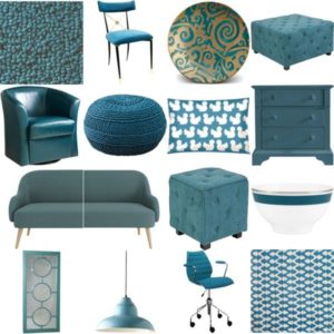 |
| Photo Credit: Polyvore |
Biscay Bay is our team favorite! It combines the serene qualities of blue with the stimulating aspects of green, and is one of the top Pantone colors for fall. The dreamy shade of blue, which we consider somewhat smoky-blue, yields a sophisticated and elegant look, while its cool hue inspires thoughts of tropical waters– both pleasant and inviting. The color is becoming a staple for wall paint options from select top paint brands as well as for lighting and fabric manufacturers. Look for this graceful blue to appear more and more as an interior design accent color.
Amethyst Orchid:
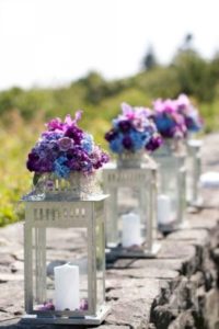 |
| Photo Credit: Soirées Southern Events Planning |
Rich and vibrant, the Amethyst Orchid adds a distinctive pop of color to wardrobe, interior design accents and floral arrangements. The hue is intriguing by creating an eye-catching and bold look. For the floral industry, we see this shade taking form in centerpiece and decorative accent arrangements for both interiors and outdoor space.
Cashmere Rose:
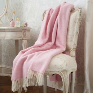 |
| Photo Credit: The Rose Garden |
Cashmere Rose has a lovely soft-pink hue, with an upscale warm appeal. Some of our horticulture clients are breeding new flowers and plants to showcase this soft and subtle shade of pink. The color gives a sense of welcoming softness to landscapes. In a certain way, the same is true for interiors of homes, especially when shades of the color are used in home accessories or accents, such as blankets, cushions and pillows. Many designers we admire are experts at adding well-placed touches of rosy pink to houses and homes, ultimately coordinating a feeling of intimacy. Cashmere Rose is cultivated in design with its richness as a gentle and composed pink that is classic and upscale.
Dried Herb:
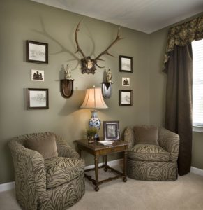 |
| Photo Credit: Knotting Hill Interiors |
Dried Herb is an olive green shade that was once thought of as safari or military. It has now been evolved into a color we now perceive as sophisticated and chic. It closely resembles the nature of earthy fragrances as we are seeing this play out more in paint, fabrics, draperies, rugs, cushions, and other textile and textile-covered interior products for residential and commercial spaces.
Cadmium Orange:
 |
| Photo Credit: Eric Trine |
Cadmium Orange is a playful, optimistic color that still keeps a sense of sophistication. It is a great accent that will harmonize with other fall trend color companions for almost any color scheme, yet it is bold enough to stand on its own. Being design trend-watchers, our ECPR team has been eyeing this color being specified by designers for walls and furniture to create bright and cheery interiors as well as in in new plant colors for the landscape.
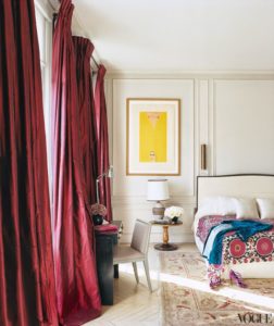 |
| Photo Credit: Bella Homestaging |
We couldn’t write about Pantone’s 2015 Fall color Report without mentioning color of the year, Marsala. Named for fortified wine, this sensual and bold color exudes style and complexity, making it a fitting hue for decorative fabrics and art throughout the home. In particular, we are seeing some design experts adopt the color for draperies, with varied shades like eggplant, reddish brown, brick, and similar pigments and tints.
Designers and editors, send us your ideas for future color blog topics.
Designers and editors, send us your ideas for future color blog topics.
The Pantone colors are clearly inspired this time. We used Cadmium Orange for a client's new kitchen, in a breakfast nook space. – Dana Design.
The kitchen sounds like a cheerful setting. Send photos to us through our website, and we'll consider them for future blog content.